Shukatsu Hub
A job-hunting app that shows today's plans and your next interview the moment you open it
15 users
Tools used
- FigmaDesign of 39 screens for iPhone
- SwiftiPhone app (SwiftUI, Swift Charts)
- iCloudData stays in the user's iCloud
- Next.jsThe first web app (PWA)
Problem
Deadlines, interviews, and info sessions were scattered across companies. Just remembering what I had to do that day took time every morning.
Observation
- I used it myself every day first, then shared it with friends job hunting.
- Most of them stopped at the very first input.
- When I once removed the red on overdue rows, a friend told me it got "a lot worse," so I put it back.
- When interview prep showed on every event, there was far too much to fill in.
- I also needed a place for notes that don't belong to any company or stage, without having to sort them.
Adding features didn't stop people from dropping off. So I went back to the design of the first input and how data is handled.
Flow
I built a web app, gave it to friends, looked into why they dropped off, and rebuilt it as an iPhone app. The home screen is a schedule in date order.
Design in Figma
For the iPhone app, I designed 39 screens in Figma, compared them with the build, and listed every screen that was missing.
- ReferenceGoogle Calendar's schedule view
- Design39 screens in Figma
- Cross-checkListed the gaps against the build and filled them in (build 21)
Screens
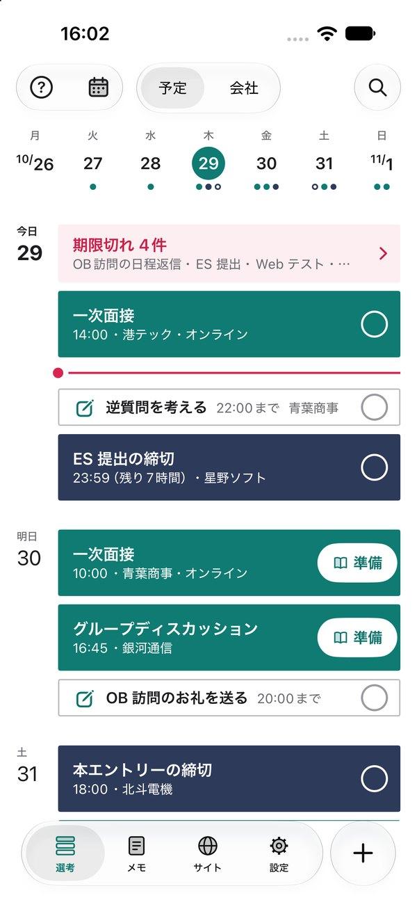
Schedule (home)
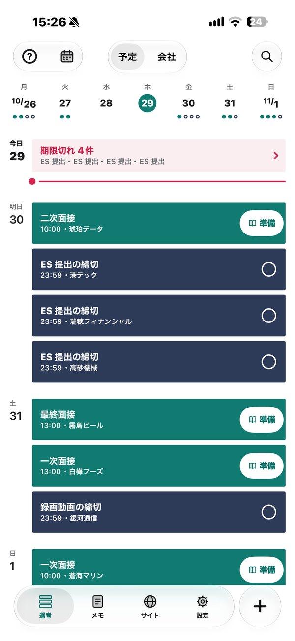
Only overdue rows are red.
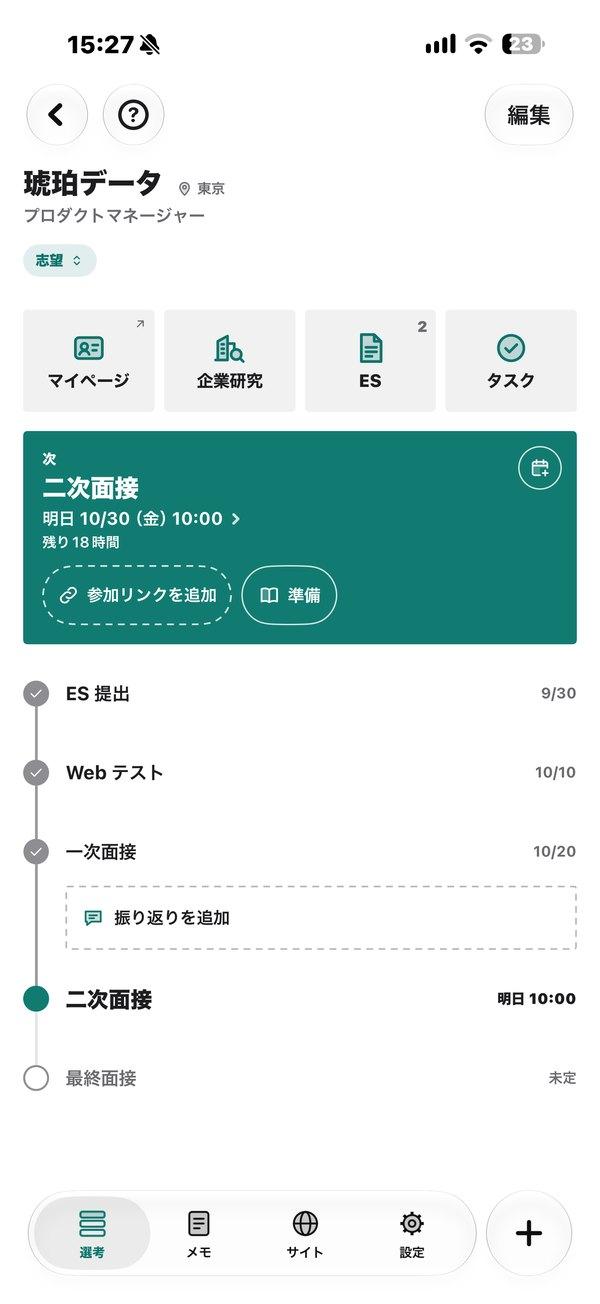
Company page
At the very top. Date and time left, with the selection steps below.
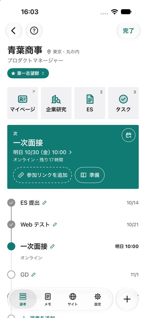
Company page (editing)
Only while editing. Add buttons and pencils everywhere catch the eye before the content does.
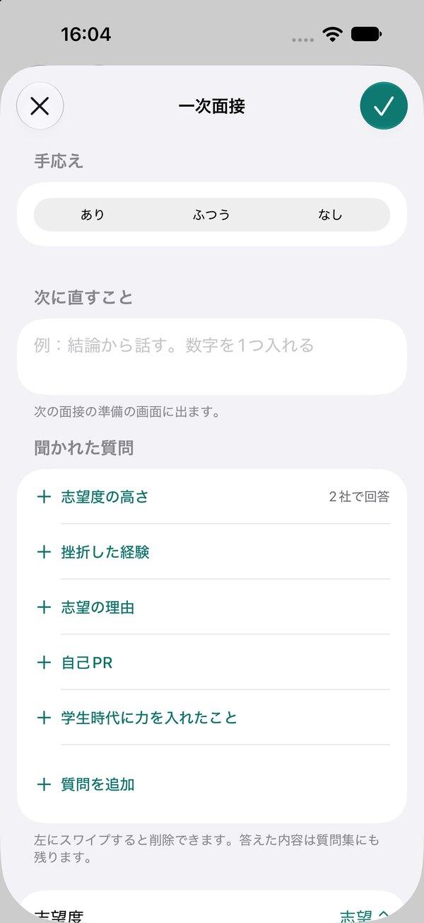
Interview review
Shows up in the next prep. Questions you add here also appear when you prepare for other companies.
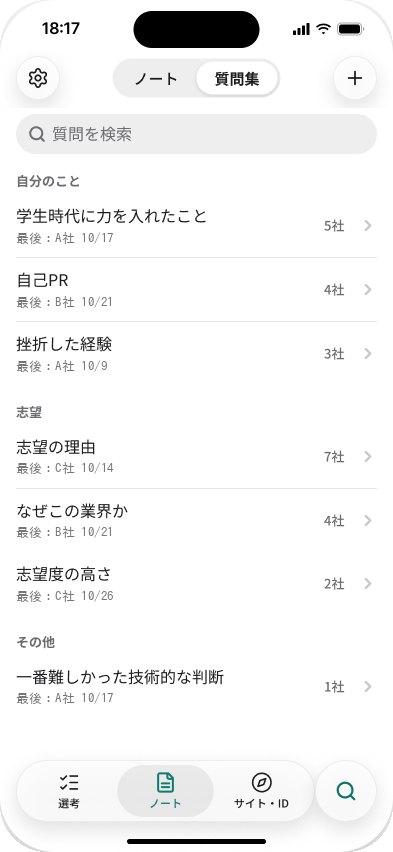
Question bank
Shows how many companies asked. Questions from your reviews, listed with a company count.
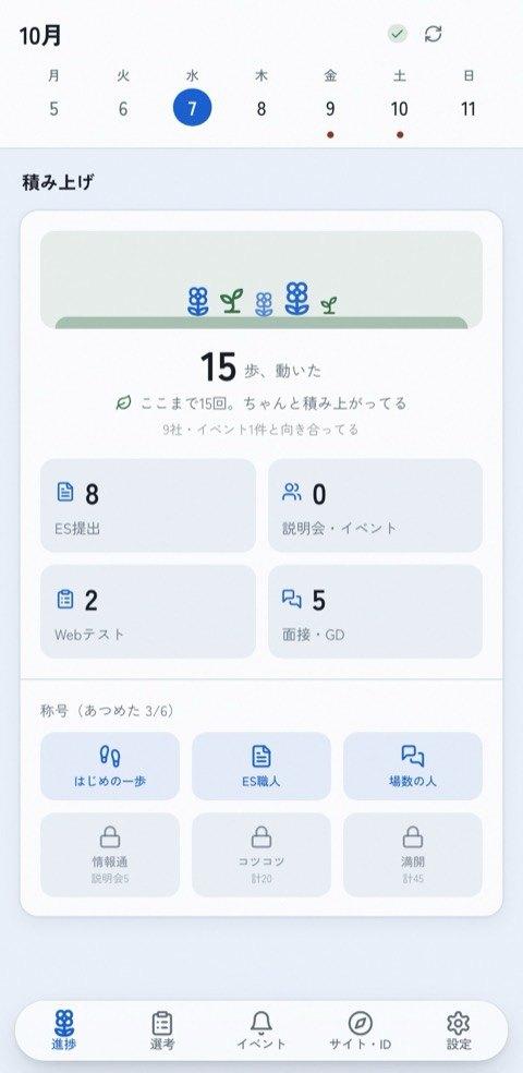
Progress (web app)
Even when results don't come. ES submissions, info sessions, and interviews, counted like steps.
Decisions
- Home is the scheduleWhat to do next and the week ahead come first, so you feel on top of things.
- "Prep" only for interviews you passed intoWhen it appeared on every event, there was too much to fill in.
- Notes need no categoryI needed a place for notes that don't belong to a company or interview.
- No calendar tabExpanding this week's strip turns it into a month view.
Result & lesson
The iPhone app works without signing in. The decision rules live in shared components and are checked by 130 tests.
When a feature goes unused, I first watch how people move through the app and rethink the entry point. I now think about what's needed before I build.
TechSwiftUI and Swift Charts (iPhone), Next.js and PWA (web), Figma
LinksOpen the web app ↗GitHub (web app) ↗iPhone app in TestFlight
Other work