
TeaMy
A tool where AIs with eight personas debate and review your documents
About ¥19.2 per task
Tools used
- FigmaSix entry points, the review screen, eight logo ideas
- LangGraphWiring the debate
- ClaudeDebate and writing (Sonnet, Haiku)
- PostgreSQLData storage
- DockerRuntime (Docker Compose)
Problem
Asking one AI one question gives a narrow view and safe, bland answers.
Observation
- In v6, outputs that broke the conditions I had set slipped through.
- Color-coding by genre made the red of each point stand out less as colors piled up.
- With a single sidebar column, New and Search got harder to reach as chats piled up.
- Reader and length didn't need to be picked. They could be read from the text itself.
Instructions in a prompt alone didn't make the AI keep the conditions I set. Conditions that must hold are built into the steps and the system instead.
Flow
I gave eight AI personas roles, had them debate, and let a CEO role pull it together. In v8β I added steps to check, review, and fix the output before it goes out.
Design in Figma
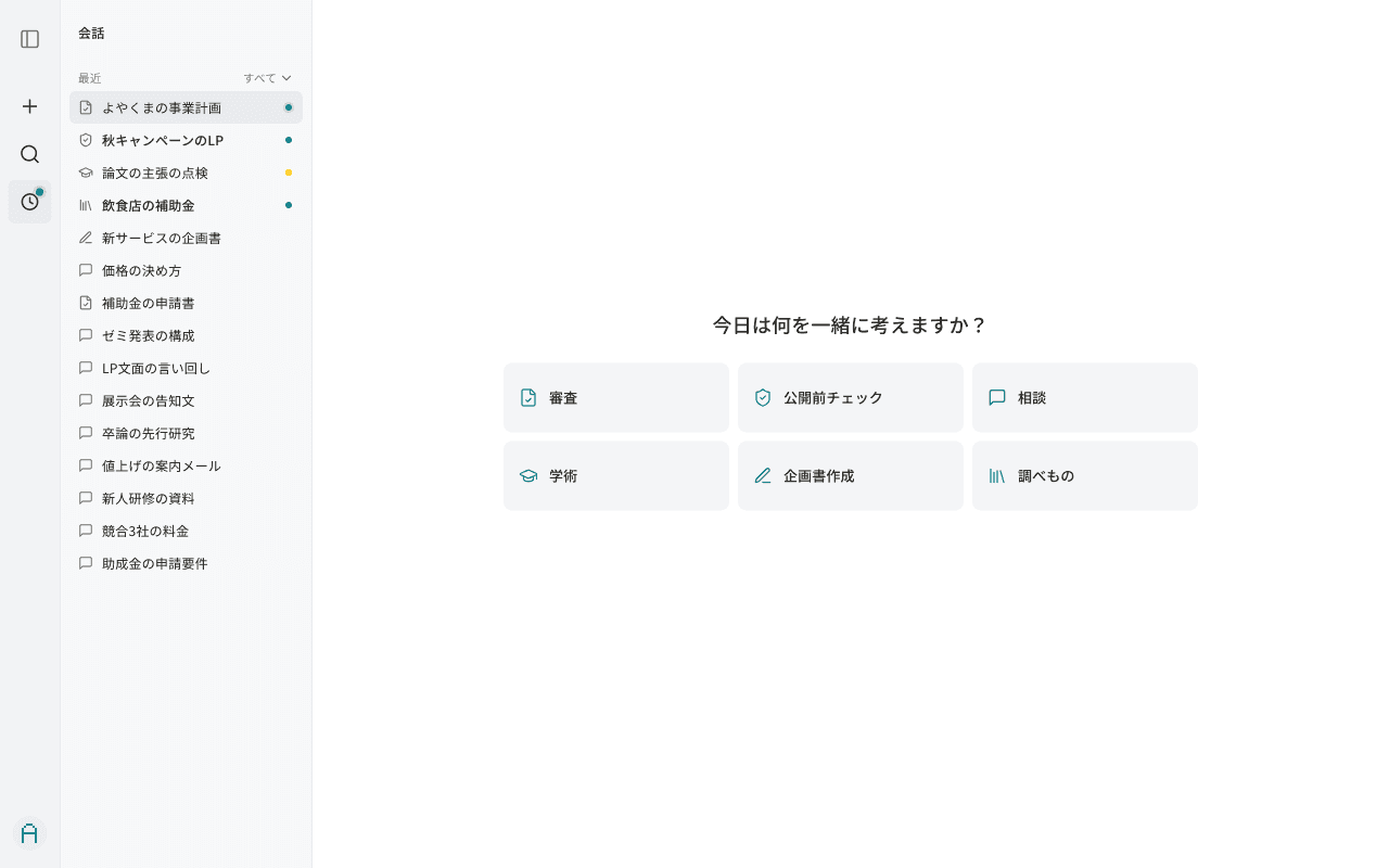
The October version of TeaMy was designed in Figma first: the six entry points and the in-review screen. I also made eight logo ideas in Figma.
Screens
Six entry points
Review, pre-launch check, consulting, academic, proposal writing, research. Each entry changes the input heading and the example text.
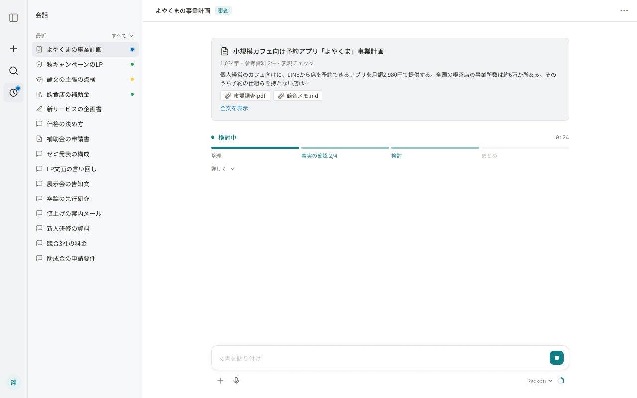
In review (Figma)
Everything you handed over in one place. Length, materials, and the request appear before the debate, and progress shows in four stages: organize, fact-check, consider, sum up.
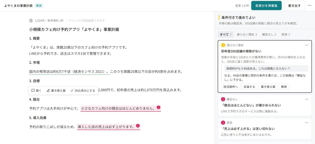
Review report
At the very top. You see the call first, like "OK to proceed with conditions." Each point quotes the original (the original here is a made-up example).
Decisions
- Dropped color-coding by genreThe more colors there were, the less the red of each point stood out.
- No picking conditionsAudience and length are read from the input and shown small.
- Split the sidebar in twoWith one column, new chat and search got harder to reach as conversations piled up.
- Raise the floor, not the ceilingInstead of raising the ceiling with expensive models, I chose to raise the minimum quality a cheap model can deliver.
Result & lesson
It runs within my circle. Even with more steps, the cost per task went down from ¥21.5 to about ¥19.2.
I learned that getting AI to keep the conditions I set takes a mechanism, not just instructions. That led me to build Ponte, a language that makes AI keep what was decided.
TechLangGraph, Claude Sonnet / Haiku, PostgreSQL, Docker Compose
Other work