
SetsuSub
An iPhone app that tells you which subscriptions to review before you are charged
431 pieces of copy revised
Tools used
- FigmaDesign of v2–v17 and every screen
- SwiftiPhone app (SwiftUI)
Problem
Subscriptions pile up without you noticing, and people keep paying for the same plan.
Observation
- Looking at subscription apps in Japan, most ended at a list and a total.
- Where you cancel depends on where you paid.
- When I re-shot all 22 screens myself and went through them, I found 431 pieces of confusing copy. For example, "Frequency check" became "One question before you pay."
- I also considered reading receipts from email, but every service formats its mail differently, so it wasn't worth the effort.
46.0% of people who had trouble cancelling said they couldn't find the cancellation page (Consumer Affairs Agency). A cleaner list doesn't lower what you pay, so the app goes as far as the suggestion and the way out.
Flow
I built an app that goes on to suggest changes. Before each charge it asks one question about how often you used the service, and adjusts the suggestion to the answer.
Design in Figma
Figma holds every round from v2 to v17. In the end I brought them together into a full set of screens in dark and light.
- v2–v4Unified → ledger → 3 directions (Toss, Things, Wise)
- v5–v9Objects and flows → screens (logos and color) → blurred header → lower half → full screens and flows
- v10–v13Money-first home and onboarding → change flow → how logos appear → white background
- v14–v17Choosing logos → plans and prices → screenshots and Gmail → manual entry and settings
- LatestAll screens (dark and light), plus the built app captured on a real device
Screens
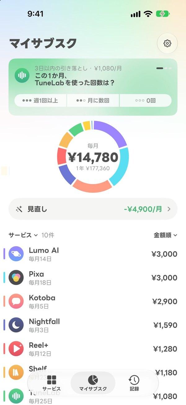
My Subscriptions (home)
One question, 3 days ahead. You answer by picking one of three usage levels.
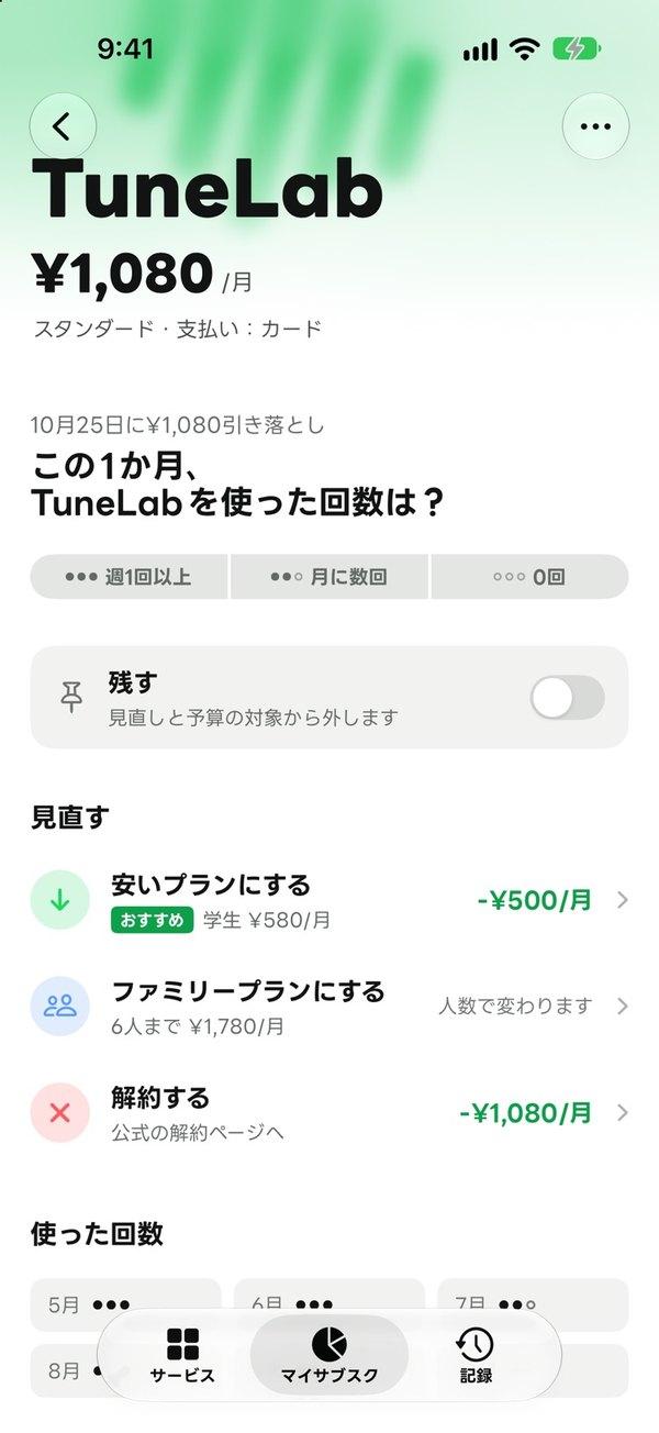
Service detail
Right on the detail screen. Cheaper plan, family plan, and cancel, each shown with how much you'd save.
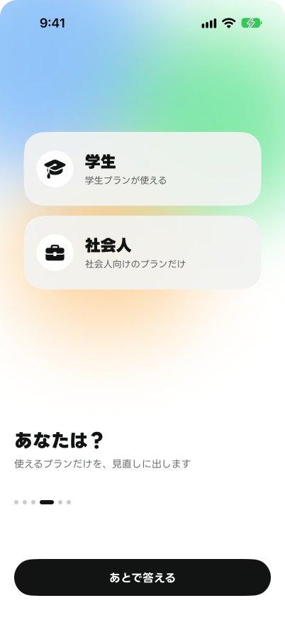
First launch
Asked only once. Working people never see student plans.
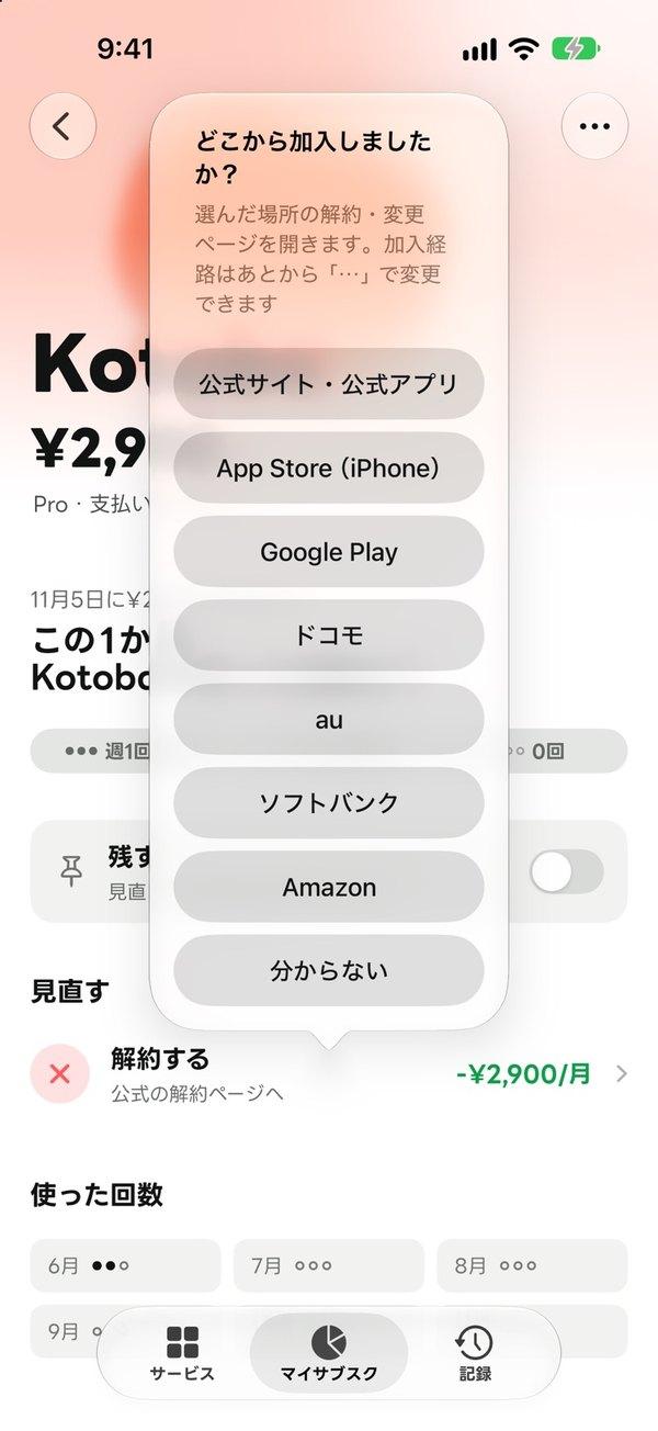
How you subscribed
Pick one, and the page opens. Where you cancel depends on how you pay.
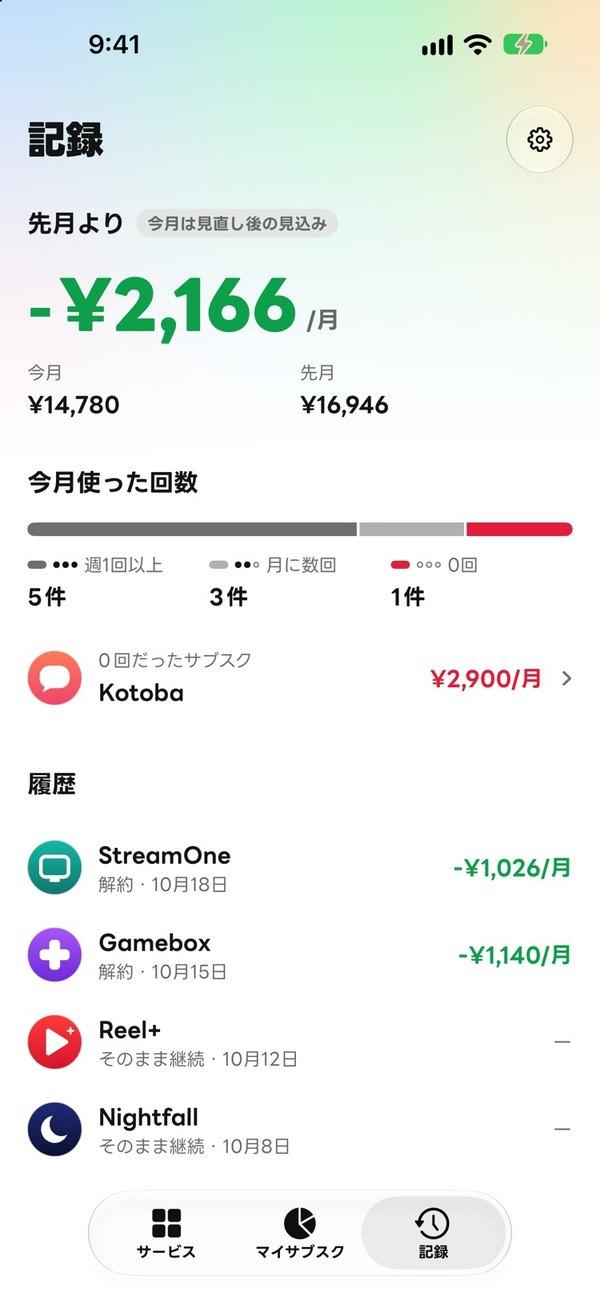
History
Shows the amount saved. The result of a review, shown as money.
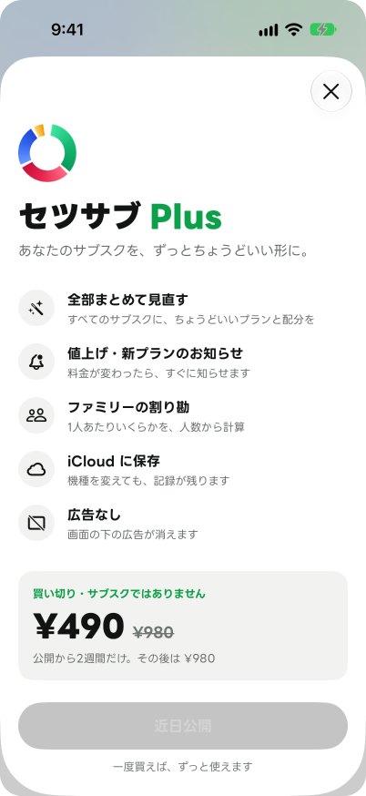
SetsuSub Plus
One-time purchase. It's an app for cutting subscriptions, so the paid plan isn't one.
Decisions
- No bank linking or cancellation serviceI judged that a solo project can't handle bank details safely. Data stays on the device, and there's no account sign-up.
- No email linking eitherEvery service formats its emails differently, and supporting them wasn't worth the cost.
- Green only means "saving""Used a lot" is gray. Green is only for money saved and amounts that went down.
- Official logosWhen one isn't available, it falls back to the App Store icon, then to a circle with the initial.
Result & lesson
I re-captured all 22 screens myself to find where people would hesitate, and revised 431 pieces of copy.
Making the list easier to read didn't lower what people paid. The next step, reviewing or cancelling, had to be right there on the screen.
TechSwiftUI (iOS), Figma (v2 to v17)
Other work